Graphical Representation and Mapping of Data | UGC NET Paper 1
Get Study Materials of General Studies for UPPSC ⇒ DOWNLOAD NOW
The transformation of data through visual methods like graphs, diagrams, maps, and charts is called the representation of data.
Graphical Representation
The representation of data is the base for any field of study. When we start the collection of data and the range of data increases rapidly, then an efficient and convenient technique for representing data is needed. It is needed because of time constraints, efforts, and resources.
The top-level authority or management does not have enough time to go through whole reports, but any small point of data should not remain hidden from their eyes. Therefore, it is required for presenting the data in such a manner that enables the reader to interpret the essential data with minimum efforts and time.
UNIT VII
– Data Interpretation (Click on the topic to
read)
|
Data presentation and data representation are two terms having similar meaning and importance.
There are several techniques for data presentation, and are broadly categorised in two ways:
- Non-graphical techniques: Tabular Form, Case Form
- Graphical techniques: Pie Chart, Bar Chart, Line Graphs, Geometrical Diagrams
Non-Graphical Techniques
There are two types of non-graphical techniques:
(a) Tabular Form: This is better known as numerical data tables. The tabular form is the most commonly used technique for data presentation. This technique provides a correlation or measurement of two values/variables at a time.
Table Pic
(b) Case Form: This technique is rarely used. Data is presented in the form of paragraphs and follows a rigid protocol to examine a limited number of variables.
Graphical Representation of Data
The data which has been represented in the tabular form can be displayed in pictorial form by using a graph. A graphical presentation (GR) is the easiest way to depict a given set of data. It is a visual display of data and statistical results.
GR is often more effective than presenting data in tabular form. There are different types of graphical representations and which are used depends on the nature of the data and the type of statistical results. The graphical representation is the visual display of data using plots and charts.
GR helps to quantify, sort, and present data in a method that is understandable to a large variety of audiences.
The visualization techniques are ways of creating and manipulating graphical representations of data.
There are several types of mediums which are used for expressing graphics, including plots, charts, and diagrams.
In literature, the words “diagram”, “chart”, and “graph” are commonly being used interchangeably. But the meaning of these words is as follows:
Diagram: The term “diagram” can be defined as a figure generally consisting of lines, made to accompany geometrical theorem, mathematical demonstration, etc. A sketch, drawing, or plan that outlines and explains the parts of something is also a type of diagram—for example, a diagram of an engine. A pictorial representation of a quantity or of a relationship is termed as a diagram in simple words.
Chart: A sheet exhibiting information in the tabulated or methodical form is also known as a chart. A chart is a graphical representation of data as by lines, curves, bars, etc. of a dependent variable, e.g., temperature, price, etc.
Graph: Graph is simply a diagram in the mathematical or scientific area of study. A drawing representing the relationship between a certain set of numbers or quantities by means of a series of dots, lines, bars, etc. plotted with reference to a set of the axis is called a graph.
A few commonly used graphical representations of data are listed below:
Histogram
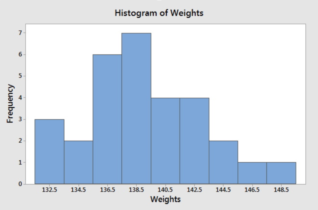
- A histogram is represented by a rectangular bar to depict frequency distribution.
- Size of the class interval is represented by the width
- The size of the frequency is represented by height.
- Class boundaries/intervals are important in the construction of histograms and represent in the horizontal or X-axis of the graph.
- Frequency is represented as height in the graph on Y-axis.
- A histogram is essentially an area diagram composed of series of adjacent rectangles.

Bar Chart or Bar diagram or Bar graph
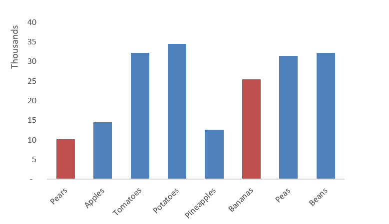
- A bar graph is a chart that uses either vertical, or horizontal bars to show comparisons among categories.
- One axis of the chart shows the specific categories being compared, and the other axis represents a discrete value.
- Some bar graphs present bars clustered in groups of more than one (grouped bar graphs) and others show the bars divided into sub parts to show cumulative effect.

Pie Chart
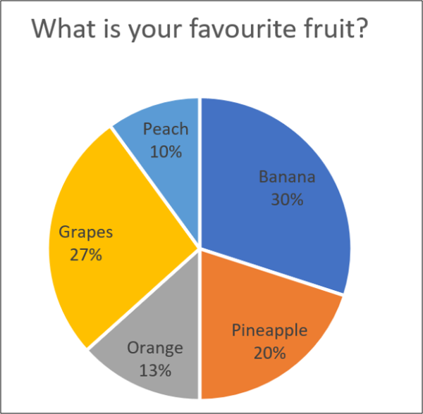
- Is a circular graph that represents total value in circle and components in part wise.
- Useful in comparing components and total value.
- Data are expressed in percentage of the total value.
- The total value is equated to 360 degrees.

Line Graph or Stick Graph or Line Chart or Line Plot or Curve Chart
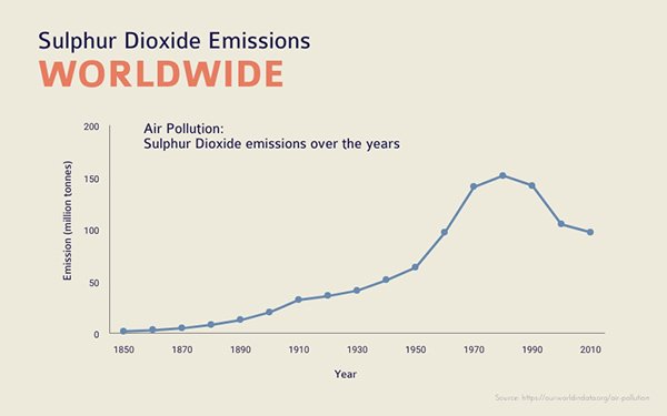
A line chart is the most basic type of chart used in finance, and it is generally created by connecting a series of past recorded data together with a line. It is a style of chart that is created by connecting a series of data points together with a line. Line charts are ideal for representing trends over time.
- Most common graphical representation
- By plotting the X-axis on horizontally while Y-axis vertically.
- Find out the intersecting point of origin and join all intersections.
- Example: cricket score in each over.

Some other Graphical Representation is:
- Frequency polygon
- Cumulative frequency curve or Ogive
- Pictogram
- Stem leaf diagram
- Scatter diagram
Mapping of Data
Data mapping is, in the most simplistic terms, knowing where your information is stored.
In its simplest form, data mapping is about relationships. In particular, it is the process of specifying how one information set relates, or maps, to another. Consider an information set that includes a list of people and their contact information. The list contains names, addresses, city, province or state, and postal code for each person. Also, consider a second information set that includes a list of people and their music preferences. This list includes listener, artist, album name, and song name for each listener. The lists are self-contained, somewhat related, but distinct.
Suppose that you wanted to create a mailing list of people who like a particular artist.
You can’t quickly get this information because there is no direct way to relate one information set to the other. The solution is to create a mapping between the name in the first information set and the listener in the second information set.
The specification of the relationship is called a data mapping. From there, you simply search the related or combined information set for all listeners in the list that like that particular artist. This gives you the corresponding mailing addresses.
For example: in the left side of figure, ‘Name,’ ‘Email,’ and ‘Phone’ fields from an Excel source are mapped to the relevant fields in a Delimited file, which is our destination.

Data mapping, in its simplest term, is to map source data fields to their related target data fields. For example, the value of let says a source data field A goes into a target data field X.
Benefits of Mapping of Data
Data mapping is essentially a way to surface and prevent issues ahead of time before they create bigger problems later. The benefits are:
- Data mapping neutralises the potential for data errors and mismatches,
- Data mapping aids in the data standardisation process, and
- It makes intended data destinations clearer and easier to understand.
Challenges with Data Mapping
The followings are a few of the major challenges that can arise with data mapping:
- Inaccuracy
- Time-wasting
- Changes
Useful links
Social links
Useful links
Contact Us
Address: B 14-15, Udhyog Marg, Block B, Sector 1, Noida, Uttar Pradesh 201301
Alpha-I Commercial Belt, Block E, Alpha I, Greater Noida, Uttar Pradesh 201310
